Pages

Tuesday, May 29, 2012

So Many Gathers...

I have something a bit different for you today.  You know those non-yarn projects to which I've alluded?  You're getting one of those today and, for a wonder, it isn't Halloween related.  Shocking, I know.  Today I'm going to talk about my brand shiny new belly dancing skirt so we'll be wandering down the sewing path which we haven't done yet.


Ordinarily doing new crafty things isn't a problem, unfortunately I'm not great at sewing.  I have an amazing machine, but I'm afraid I hold it back quite a bit with my abysmal technique.  I have done quite a bit of sewing, so I'm pretty sure it isn't all practice that I need, but there are things that I still really struggle with.  Like sewing even straight lines.  The other unfortunate bit is that I really don't have a lot of choice; I have got to make a new skirt.  I have 3 skirts of the "10-yard" variety (that's roughly how much fabric goes around the bottom hem, I told you I had a lot of practice) and all of them are rather heavy.  I need a lighter skirt or dancing in the increasingly unseasonable heat is going to be brutal.  Tribal dancing outfits are not generally known for being light and airy and the 3 skirts I have most certainly are not.  I waited for a good coupon and managed a 50% off one item coupon and since one cut of fabric counts as an item I was in business.

Washing, drying, and ironing the 6ish yards that I got was something else.  I'm not terribly keen on laundry to begin with and my poor sewing skills are matched only by my more wretched ironing ability.  6 yards takes FOREVER to iron.  But I managed to get everything ironed, pinned, and cut in one day so that's something.  This is not an original Lyssa pattern, by the way.  I'm still quite hopeless at sewing so I use patterns that other people make.  The one for this skirt came from Annabella who, I might add, has a number of other useful patterns if you go exploring her webpage.

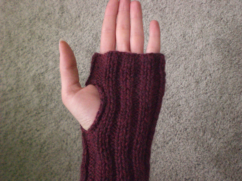
Having prepped everything, the next step is hemming and tier joining.  That's the easiest part by far.  Especially since I discovered that I have a fair number of hemmer feet for my sewing machine.  I had never used any other them but I grabbed one and tried it out.  Holy hell do those things work well!  My skirt has an almost 10 yard hem and I did the whole thing with a hemmer foot.  It's quite possibly the best hem I've ever done.  I think I have a new quest...to find out what all the random presser feet I have do.

Not perfect, but not too damn bad either!

The next step is sewing the tiers together and that involves gathering.  Now, the first time ever that I made a skirt with this pattern it did not go terribly well.  The resulting skirt was passable, but hand gathering a combined 15 yards of fabric (about 5 yards in the second tier and almost 10 in the bottom tier) is not what I would call fun.  This time I swore I would do it the "easier way" and try out my gathering presser foot.  Trouble is, I'd never used a gathering foot before.  The internet turned up a bare handful of tutorials so I wasn't flying completely blind.  I tried out a few scrap pieces to get a feel for it and is surprisingly easy.  Well, unless you want to sew another piece to the fabric that you're gathering.  That's a good deal harder.  The other challenging bit is keeping the fabric ratio correct.  I had to do a bunch of adjusting because it seemed like every time I touched the fabric it changed how it would feed.  Still, it could have gone a lot worse than it did.


I'm thinking I should make another skirt or two for practice and for extra (well made) changes.  My first 3 skirts aren't terribly well made and having more than one skirt that I know isn't going to fall apart for faire would be good.  Garb tends to get gross pretty quickly so having multiple changes is a good thing.

Wednesday, May 16, 2012

DIY Mad Scientist Lab Signs: Part 3

This should be my last installment of sign making.  I'll keep making signs, but I don't expect to use any new techniques from here on.  This is a very minor retooling of the method that Dave Lowe uses to make his FedEx box tombstones.  Since it is basically his method I'm not going to go step by step over it.  I'll just be hitting a few high points where I thought a bit more information was necessary.

Making signs this way gives you a more robust sign because you use foam core instead of cardboard.  The sign will be sturdier and take paint more evenly, too. 

The hardest part was picking a font.  I wanted something that looked like it belonged with a laboratory but not something that looked too old since a lot of my signage is more modern.  In the end I wound up looking at all the fonts in Word and all the fonts on 1001freefonts.com. I found a number that would work, but was it ever hard to choose between them!

Looking at fonts made me think of other potential issues too.  Like, did I want the sign to be more like a plaque that you would see on an old building or did I want it to be a big, proper sign?  Too many options!  I did finally settle on a font called "Bertram".  I liked it because it had a bit more interest than just a regular Copperplate font, though hindsight says Copperplate would have been easier to cut out.

Having picked the font I wanted, I went to print out some nice, big letters and discovered a problem.  I use something called Open Office instead of Microsoft Office because I'm cheap and Open Office is free.  Trouble is Open Office is almost, but not quite, entirely unlike Microsoft Office.  In short, the largest it would let me make my text was 96 point.  I raged about this for a while until the solution hit me.  If you do it in the Excel-like program instead of the Word-like program, you can tell it to print an enlargement.  (-:  So I typed in the name of my lab, made it 96 point in Bertram, and then made the computer enlarge it 300%.  I had to turn the paper to landscape and print off 7 pages (because I could only get 2 letters , maybe 3 if I was lucky, per page) but I made it work.


It took me a bit of time to get the pages laid out and taped together because I wasn't smart enough to put a grid under my letters so I had to duplicate the font kerning by hand.  It took me a while but I managed it.  If you're wondering, and I'm sure you are, kerning is what letter spacing is called when the letters are placed to be visually pleasing instead of by exact spacing which can leave large gaps between letters with overhang like T, W, and V.  This is the sort of thing you learn when one of your former roommates majored in visual communication.

Then all I had to do was tape the template down and cut it out which isn't nearly so easy as it sounds.  I was using 1/4 inch foam core and getting the x-acto to cut deep enough to go through the whole thing was challenging at best.  I don't think it would have worked half so well if I had picked a more complicated font.  There is one really super important thing you have to know at this point.  It is critical that you not mess up any of the white section of the template.  Cutting too far into the black of the font is fine, you aren't using that (though you can if you can keep it looking nice) but because this sign has an engraved look you have to save all the little white bits you cut out from the letters like A, B, and O.  Here's why:


Looks rather odd doesn't it?  So keep those little bits safe and do your best not to cut into them any more than is absolutely necessary.

Once my letters were all cut out, and the necessary bits saved, I trimmed the sign down a bit so that it would be bordered by a backing piece of foam core.  The piece I used for backing was 1/2 inch foam core and I didn't cut it down at all.

This is where my instructions are going to deviate from what I actually did.  What I did was then spray glue the boards together, with all the extra bits to fill in letters, and then paint the board. What you should do is paint the pieces first and then glue them down.  Why?  Because at some point in the process the glued foam core came unglued and I discovered that it was easier to paint that way.  So grab some spray paint and paint all your pieces and then glue them together.  It works a lot easier because you can spray the interior of the letters directly and not have to worry about missing spots.  Also, you want to make sure your surfaces are completely flat when you go to glue them.  I had a world of trouble getting the stupid thing to stick long term.  My first gluing failed, but for the second one I weighted the thing down for 24 hours while the glue set.  Worked much better.

Looks a lot better with those extra bits put back in place, doesn't it?

I also discovered that if you use spray paint for this instead of normal paint you can get an antiqued look or even make the foam core look like stone.  This works best if you suck at spray painting (which I do) because all the darker blotchy bits start to look intentional.  I didn't get a pic of how much the foam core looked like granite there for a while because, as I said, I suck at spray paint and didn't want to have a camera incident.  But I did go over the "metal" portion of the sign with some black to give it a more abused look.

It probably would have looked better aging the sign with gold and copper paint instead of gold and black paint but I was using what I had and what I had was black and gold.  It looks rather more like it's gone through a fire than I would have hoped, but I suppose I can go back and repaint if I decide I don't like it. Now all I have to do is figure out how to hang the thing.

Since there were all sort of pieces left from making the main sign, I decided to throw together another one.

A bit of paint and glue (Elmer's this time), and behold!  A perfect sign to denote where my intended lab area is.  (-:


I know that's not the greatest camera angle, so I zoomed a bit to give you a better idea what it looks like close up.


And yes, the letters are raised.  It's just not terribly easy to tell when the sign is on display.


I quite like them, though.  They make me happy.  (-:


Sunday, May 13, 2012

Knit Fingerless Arm warmers

So you may have noticed a slow down in the posting schedule.  Work has gotten super busy recently and it's going to stay super busy for at least a month. Then we're packing up the lab to move, which should be it's own special hell.  It doesn't help that I also had a piece of equipment decide to commit suicide;  I needed that thermalcycler.  And then my other toys started breaking.  I've not been having a good few weeks.  Anyway, the new workload is leaving me drained enough that I pretty much get home and collapse.  Plus my lunch breaks have gotten really irregular.  As I do a fair amount of crafting over lunch breaks and in the evenings having that time compromised is really slowing me down. I also have a number of non yarn projects going which aren't going to help the knitting/crocheting scene.  I'll do my best to keep things going as normally as I ever do, but I'm making no promises.

Today I have a knitting pattern for you.  It's super simple, just a swath of ribbing sewn into a tube, but since I've not really done much with making my own knitting patterns I think it's doing pretty well.  I do knit quite frequently but the projects tend to be from other people's patterns.  I'd like to start making proper knitting patterns at some point.  The main problem I have doing that is sizing.  I make things to fit me and things that fit me are not scaled to fit the "average" body form.  Plus I have no idea how to go about writing instructions for multiple sizes.  I suppose I'll have to hunt around and find what the average size measurements are and then see about extrapolating my instructions from there. 

For now, I'm sticking with simple and it doesn't get much simpler than this.  Originally I had intended these to be for the yearly medieval faire.  I had gotten both of them made, if not sewn together, and then found out we were supposed to have a nice warm faire for once (which we did, it was delightful).  Since it was no longer pressing that I have something to keep my arms warm the almost done warmers got set aside so that I could play with other things.  Unfortunate, but not terribly surprising.  I get distracted from oooo, shiny!  About like that.

Unlike my usual yarn working, where I just go grab a ball of something and see what it turns in to, I did specifically search out a wool yarn from my stash.  Wool is the only fiber that will keep you warm even if it's soaked through.  Since these will at some point become faire wear (aka garb) I need them to keep me warm no matter what the weather pitches at us.  The pattern is just a simple ribbing.  I like the way ribbing prevents you from having to do any serious shaping.  I've also made arm warmers before and they, while pretty and bright green, have an incredibly obnoxious tendency to slowly slide down, and off, my arms.  Hence the ribbing.  I love ribbing for shaping without having to do math and figure out decreases.  I've only worn them once so far and it worked out pretty well.  I didn't wear them while dancing though so that remains to be tested.


Fingerless Arm Warmers


80 grams (about 160 yards) Patons classic merino wool
size 6 needles

Gauge:  6 sts in 2/2 ribbing is 1 inch

Finished measurements:  Each arm warmer is 13 inches long and about 6 inches wide before being sewn together.  When stretched, they are 9 inches wide.

Fits small to medium sized arms.

Make 2
CO 44
K1, (p2, k2) ribbing 10 times then p2, k1

Work as established until 13 inches long
bind off.

Sew the side seam with mattress stitch, leaving a space for the thumb.  The pair I made have a 2 inch space for the thumb which is about 1 1/2 inches down from the edge.  You will probably want to adjust the thumb hole for your own comfort.  I tend to make thumb holes a little differently from most people.  I make them larger and in a slightly different position from what would be considered normal.  This is because I have what is known as a 'hitchhikers' thumb, which means my thumb bends at more than a 90 degree angle from my palm so anything with thumb openings fits me a little differently.


Wednesday, May 2, 2012

DIY Mad Scientist Lab Signs: Part 2

In a previous post I went over how to make lab signs with stencils. The method I have for you in part 2 is a lot easier but can also get expensive in a hurry.  It uses vinyl adhesive letters instead of all the stenciling.  The end result looks very professional so if cost isn't a big deal for you this is the way to go.  I got my letters on sale and with coupons so that helped out quite a bit.  It's totally worth holding out for the ubiquitous 40% off a single item coupon if you've got the time to do so.

Vinyl Letter Signs


You will need:

Vinyl lettering
Card board
Painters tape
X-Acto knife and/or scissors
a safe surface on which to cut your cardboard
background paint
wax paper or plastic spacing sheets

The main issue with the vinyl letters is that you really should know what you want your signs to say before you go get the lettering.  Write out everything you want your signs to say and then make a list of how many of each letter you need.  The reason for this is the number of letters you get. Somewhere on the package it tells you how many of each letter is in there you need a list to compare that to the package to make sure you get enough letters. 

Just so you have a reference, I used an indoor latex semi-gloss paint in white (American Tradition in Anthem White, if you want to be really specific.  It was leftover from painting the trim in my house.) and the letters are 1 inch Helvetica.

This version is easier in some respects than the Stencil Sign and harder in others.  You save a whole bunch of time by not having to cut out a ton of letters but that comes at a higher price tag.  Vinyl letters cost more than a bit of paint and poster board.  How much more depends on where you get your letters, how big they are, and what font you want them in.  I honestly don't think I would have gone this route at all had it not been for a number of lettering sheets in the stencil box but I'm glad the letters were found.  I really like how the signs turn out but it made me wish that the budget was a little bigger so I could do more with store bought letters.

After you have all your materials together, you need to lay out the lettering.  I was lucky enough to have spacing/letter transfer sheets that I could use, but if you don't have those you can use wax paper with a sheet of graph paper underneath it.  Take your time and get the letters evenly laid out.  It helps with the next step.  If you're making a bunch of signs you can put more than one set of lettering on a sheet.  You'll have to adjust the lettering a bit when you go to stick the letters on the signs but it saves time to do as much of your lettering layout at one time as you can.  It also helps make sure you don't unexpectedly run out of a letter before you've committed yourself.

Once you have your lettering roughed out, take a look at your cardboard and see what size you need for the sign to look good.  Cut your card board to size and give it at least 2 coats of paint with your background color.  As soon as the paint is dry you can start the next step.

Roughed out signs on a spacing sheet.  The white behind it is the card board base for the sign.  Note the second sign's lettering underneath.  It isn't properly spaced yet but setting the letters out early makes sure that you have enough letters.
Slide the sheet with your letters around on your sign base until you get the first line about where you want it.  Then take your painters tape and use it to block out where your letters are actually going to go.  You'll have one long piece for under the letters and then one on each side to tell you where to stop and start.  MAKE SURE YOU LEAVE ROOM FOR SPACES BETWEEN WORDS!  You'll notice "evacuation gate" looks more like "evacuationgate" on the rough out so when I was setting the tape for the sides I made sure to move them out an extra little bit.  This is how you make sure your letters stay in even lines without having to mark on your card board base.  Repeat the process for each line of lettering.


Top line spacing tape
Bottom line spacing tape

Now you're ready to start putting your letters on the sign.  You need to be really careful here because your letters may stick permanently to your base as you're putting them down.  If you think you may have to do any repositioning try to put as little pressure on the letters as possible, it should help them peel up again if you need them to.  If you end up using a semi-gloss this is much less of a problem.  The letters come up more easily on the slickness of the semi-gloss.  Test that out before you rely on it, though, because after a few hours the letters bind to latex paint irrevocably.  Carefully line up the letters using the tape lines as a guide.  Make sure none of your letters end up on the tape or they will peel off with the tape (possibly taking underlying paint with them) when it's time to remove it.


If you have multiple words on a line it might be helpful for your spacing if you start on the last letter and build the word in backward.  That's another reason the lettering sheets come in handy; you don't have to try to spell things backward, you can just peel the letters off in that order.


Go one line at a time, filling in your words both forwards and backwards as needed for spacing.


When you're happy with what you have, it's time for the moment of truth.  Time to peel up the tape lines!


Now you do any extra trimming on the card board to make your sign look nicely finished.  You can see the bottom edge on my sign is uneven and looks funny, so I trimmed it.  Using a stiff bit of cardstock as a guide, I lined it up with one of the corrugations on the card board to make sure the line I was about to cut was as close to perfectly straight as possible.  Then you score a line along the edge of your guide with an x-acto knife and use that to help you cut through the card board all the way.  You want the sharpest tool you can get for this part.  You can use scissors but they compress when they cut and it won't give you the best edge.


And voila!  A surprisingly professional looking sign.


You can also combine the vinyl lettering with a stencil sign.  If you want anything with arrows, for instance, or if you have a sign that's going to be prominent enough for people to get a good look at it.  I did a couple signs with both stencils and stick on letters.


The decontamination signs are for my entry and hall bath door, so they're actually going to be on an interaction level with my guests.  That's how I've been deciding which signs get the fancy letters.  If the sign is going to be seen mostly in passing, like the one for the porch, it doesn't need to be absolutely pristine and so stencils work great.  If the sign is going to be in a high traffic area, like the wash your hands sign and the evacuation gate, having them be a little nicer makes good logical sense. The decon signs are also good examples for why I don't use vinyl letters for everything.  The 1" Helvetica letters I used on the round sign came with 3 N's.  Decontamination has 3 N's in it.  The number of lab related signs you can make without N's is vanishingly small.  Think about it; "caution", "warning", "danger", "radiation", "emergency", and anything with "no" or "not" are out of the question when you're out of N's.  I can still do "biohazard" and "high voltage" but I'm going to be really limited in what I can do without buying more letters.  This is why planning out your wording beforehand is so crucial.