Making signs this way gives you a more robust sign because you use foam core instead of cardboard. The sign will be sturdier and take paint more evenly, too.
The hardest part was picking a font. I wanted something that looked like it belonged with a laboratory but not something that looked too old since a lot of my signage is more modern. In the end I wound up looking at all the fonts in Word and all the fonts on 1001freefonts.com. I found a number that would work, but was it ever hard to choose between them!
Looking at fonts made me think of other potential issues too. Like, did I want the sign to be more like a plaque that you would see on an old building or did I want it to be a big, proper sign? Too many options! I did finally settle on a font called "Bertram". I liked it because it had a bit more interest than just a regular Copperplate font, though hindsight says Copperplate would have been easier to cut out.
Having picked the font I wanted, I went to print out some nice, big letters and discovered a problem. I use something called Open Office instead of Microsoft Office because I'm cheap and Open Office is free. Trouble is Open Office is almost, but not quite, entirely unlike Microsoft Office. In short, the largest it would let me make my text was 96 point. I raged about this for a while until the solution hit me. If you do it in the Excel-like program instead of the Word-like program, you can tell it to print an enlargement. (-: So I typed in the name of my lab, made it 96 point in Bertram, and then made the computer enlarge it 300%. I had to turn the paper to landscape and print off 7 pages (because I could only get 2 letters , maybe 3 if I was lucky, per page) but I made it work.
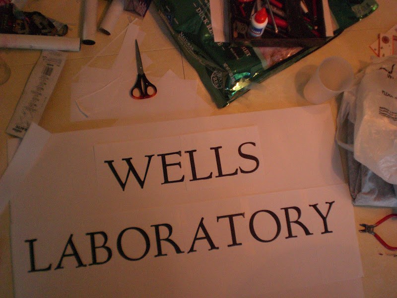
It took me a bit of time to get the pages laid out and taped together because I wasn't smart enough to put a grid under my letters so I had to duplicate the font kerning by hand. It took me a while but I managed it. If you're wondering, and I'm sure you are, kerning is what letter spacing is called when the letters are placed to be visually pleasing instead of by exact spacing which can leave large gaps between letters with overhang like T, W, and V. This is the sort of thing you learn when one of your former roommates majored in visual communication.
Then all I had to do was tape the template down and cut it out which isn't nearly so easy as it sounds. I was using 1/4 inch foam core and getting the x-acto to cut deep enough to go through the whole thing was challenging at best. I don't think it would have worked half so well if I had picked a more complicated font. There is one really super important thing you have to know at this point. It is critical that you not mess up any of the white section of the template. Cutting too far into the black of the font is fine, you aren't using that (though you can if you can keep it looking nice) but because this sign has an engraved look you have to save all the little white bits you cut out from the letters like A, B, and O. Here's why:

Looks rather odd doesn't it? So keep those little bits safe and do your best not to cut into them any more than is absolutely necessary.
Once my letters were all cut out, and the necessary bits saved, I trimmed the sign down a bit so that it would be bordered by a backing piece of foam core. The piece I used for backing was 1/2 inch foam core and I didn't cut it down at all.
This is where my instructions are going to deviate from what I actually did. What I did was then spray glue the boards together, with all the extra bits to fill in letters, and then paint the board. What you should do is paint the pieces first and then glue them down. Why? Because at some point in the process the glued foam core came unglued and I discovered that it was easier to paint that way. So grab some spray paint and paint all your pieces and then glue them together. It works a lot easier because you can spray the interior of the letters directly and not have to worry about missing spots. Also, you want to make sure your surfaces are completely flat when you go to glue them. I had a world of trouble getting the stupid thing to stick long term. My first gluing failed, but for the second one I weighted the thing down for 24 hours while the glue set. Worked much better.
 |
| Looks a lot better with those extra bits put back in place, doesn't it? |
I also discovered that if you use spray paint for this instead of normal paint you can get an antiqued look or even make the foam core look like stone. This works best if you suck at spray painting (which I do) because all the darker blotchy bits start to look intentional. I didn't get a pic of how much the foam core looked like granite there for a while because, as I said, I suck at spray paint and didn't want to have a camera incident. But I did go over the "metal" portion of the sign with some black to give it a more abused look.

It probably would have looked better aging the sign with gold and copper paint instead of gold and black paint but I was using what I had and what I had was black and gold. It looks rather more like it's gone through a fire than I would have hoped, but I suppose I can go back and repaint if I decide I don't like it. Now all I have to do is figure out how to hang the thing.
Since there were all sort of pieces left from making the main sign, I decided to throw together another one.
A bit of paint and glue (Elmer's this time), and behold! A perfect sign to denote where my intended lab area is. (-:

I know that's not the greatest camera angle, so I zoomed a bit to give you a better idea what it looks like close up.

And yes, the letters are raised. It's just not terribly easy to tell when the sign is on display.

No comments:
Post a Comment